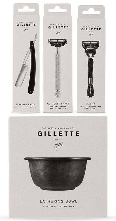
Loving B+W Package Design
I've been loving the chic simplicity of black and white packaging. It's simple, refined, and looks great anywhere - whether on your counter or in a shop window. It's a beautiful example of designers doing more with less.
For more design inspiration, check out my Packaging Pinterest board.
{ Source: Hudson Made: Worker's Soap / Our Berlin Vodka / March Pantry Kosher Salt / Tokyo Milk Handcreme / Gillette / Day }


